skip to main |
skip to sidebar
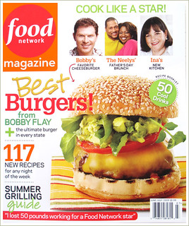
It's A Cover Up
Food isn't just for eating anymore. Food is an event, it's a journey and it's a story. We've seen the popularity of television food shows sky rocket, but the good old fashioned print media still has a strong hold of food followers. This month at The Inspired Plate our assignment was to find a food magazine cover and be inspired by it. The interpretation of how to be inspired was left up to the eye of the beholder so our entries my vary. I decided to 'recreate' a cover using the elements of design in my inspiration cover. I chose the June/July 2009 Food Network Magazine Cover. Who could go wrong with a Bobby Flay Burger?

Before I show my rendition, let me explain what I saw and what I set out to emulate. First the burger was HUGE, Tall and of course very tasty looking. I found it interesting that the burger was almost entirely covered with cheese. I noticed the grill marks on the bottom bun and the bazillion sesame seeds on the top perfectly shpaed bun. I also noticed that the colors in the text and even the logo were dependent on the colors in the food and accessories. There weren't many accessories in this example. Something I latched on to and appreciated quite frankly as I don't have a huge prop closet. So before I even set out to design, I had color, height, use of space and food quality on my mind. Some things I ran into that were challenging was the actually toasting of the bun. I think the bun in the first image is probably a bit more crunchy than I would like with that much char. ( I wanted to eat mine after so I went a little lighter with the toasting.) I do think it adds a bit of drama and intrigue to the first image that mine might lack. I also wanted to skip the tomato...no reason really but everyone puts a tomato on. I was hoping to use some different toppings that might add some interest. I chose the red towel to compose my picture to keep the red tones that inspire appetite in the image. I also opted to use the yellow peppers instead of the cheese for yellow element. As an aside...mine did have cheese...my butcher stuffed it when he made the patty, it was a black and bleu burger...and oh yeah was it yum! I liked that this cover had clean lines and while it advertised many parts of the magazine it also had a simplicity about it.
So without further delay, here is my mock food magazine cover...

Side by Side...

So come on over, I'll fire up the grill and we can find lot's of tasty toppings to decorate your BIG Burger. And while you're here, take a look at what the talented Carey Pace | Kingsport Photographer is cooking up on her magazine cover.

11 comments:
It's perfect and stunning Kat!! I love how you recreation is completely scaled and in balance with the original. And - can I add "yum?" :)
what an awesome burger! You did a wonderful job replicating that beast of a burger...great work!
That's a BIG burger!!! Llve the 3 tested exercises to stretch your jaw!!! ;)
I seriously think your burger looks way more delicious than the original! I love that you can see more of the meat itself. The toppings look delicious, but I want to see the BEEF. :) Great job, Kat! Making grilled meats look delicious is no small feat.
Pretty food!
Kat!! This is amazing!! I LOVE your fonts, your colors, your Food Magazine without a network title :) .. your burger is by far more appealing than the original. Outstanding job!! You know.. this totally speaks of your personality of a mom, wife homeschool teacher.. you should be taking this on the road girl!! It can definitely go places.And I just caught that.. "tested exercises to stretch your jaw" . Too cute!! :)
Kat this is awesome. I love your bright colours, and fun text. Your burger looks so yummy and juicy, I'd like to reach in and grab it for myself. Lovely work. :)
OH MY this burger is grilled to perfection!! I want to know your secret! It's gorgeous all around from the bun to the lettuce! I also love your sense of layout and design, so fun and eye-catching...I'd choose this magazine, for sure! I gotta say, I would choose your burger over FN's. Awesome job!!
That looks good enough to eat ;) Love the yellow peppers and the red tablecloth. Great job!
Love your cover Kat. I actually prefer the look of your burger, without the cheese all over it. Loved reading your explanations of why you made certain decisions, clearly a lot of work went into this project and it shows :)
Kat... OK! I'll be right over!!! Like I said on another post, I'm not a burger person, but this is another one I'd dig into. Love your lighting here!
Post a Comment